
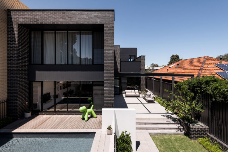
Cool and calm, yet with distinctly moody elements, Urban House by Robeson Architects takes full advantage of its mixed-use zoning to offer flexibility for decades to come.
There is purpose behind every detail of Urban House. From the street front, its somewhat ambiguous representation of its use could pass as a residential property or a commercial space. In this instance, it’s both.
The design and materials of the street elevation are completely intentional, relating directly to its mixed-use nature, flexibility for future use, and its location in a zone where properties transition from commercial to residential.
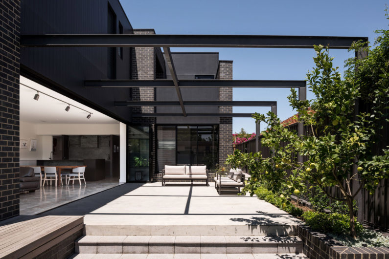
Situated on a 422sqm site, the scale, height and openings on the ground floor are aligned with the commercial property on the east, while the building has been setback to the west in respect of the neighbouring single-storey dwelling.
Creating a low-maintenance, minimal home for a busy young family, architect Simone Robeson’s brief called to utilise the mixed-use zoning of the site by creating a self-contained commercial tenancy at street level that could initially be leased by the owner, and later used as their home office.
“With flexibility and future use being of paramount importance, the design and interiors needed to be adaptable for the family’s needs now and in the future,” says Simone. “While the areas the family use the most needed to be accessible and hardwearing, the interiors also could not be “on-trend”, but could change over time with different furnishings or users.”
The residential component of the property is hidden above and behind the commercial space, and encompasses four bedrooms, 3.5 bathrooms, and an additional study on the upper floor.
Open and flexible, interiors are orientated to the northern aspect and pool, while Japanese influences are expressed through colour and texture, along with matte finishes and deep colour accents.
In keeping with the minimal, low maintenance feel of the home, northern shading, cross-ventilation and opening types were designed to showcase efficient passive design principles whilst still maintaining the desired outlooks. “Coordination began early in the design development stage with the engineer, surveyor and energy consultant, as an efficient structural layout was important to maintain efficiencies with the relatively open living zones,” says Simone.
Full height, shaded glazing allows for leafy views of the park to the north, while level thresholds between courtyard and living, together with the same floor finish, create one large and completely seamless indoor/outdoor space to host parties.
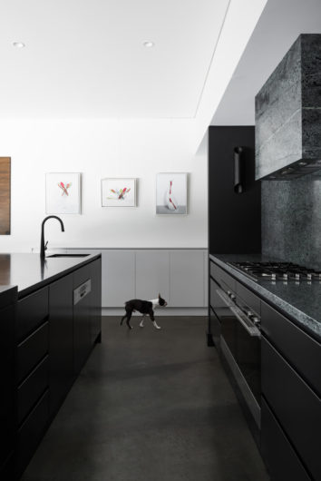
“Burnished concrete floors, black timber lined feature ceilings, clean white walls and black timber veneer all lend a minimal tone to the interiors, as per our brief”, Simone says.
Striking dark ceilings are a continuation of the external black cladding that wraps under the sofit and into the compressed entry space, which opens up to the expansive living zone.
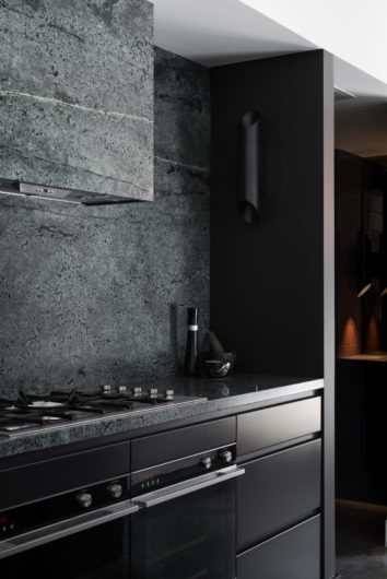
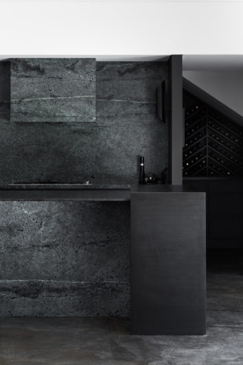
Immediately arresting and impressive in detail, the kitchen features Celadon Dark granite/quartz from Marble & Cement Work, which was selected by the architect at the stone yard and carefully detailed to ensure the veining aligned as it crosses the rangehood and extends on to the splashback.
“It was an unusual grey/green tone and the slabs had been sitting in the factory for a while. They were not popular so no one else wanted it!” says Simone. “But it was such a good find as the colours suited the palate perfectly and lent the room a moody quality.”
The 20mm Zimbabwe black honed granite feature island bench top ties in to the kitchen space effortlessly, while the scullery features self-matte bianco tiles from Attica, and a custom cabinetry display for the owners’ wine collection.
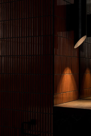
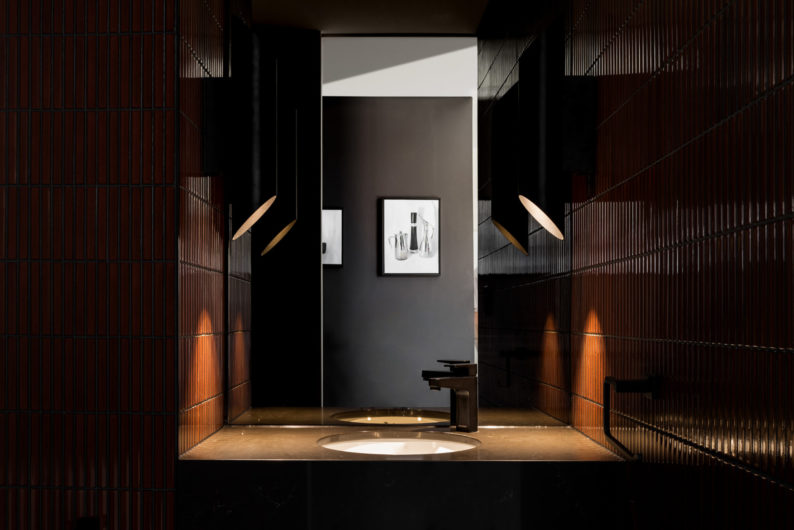
Superb detail to material selection carries throughout the home, including the bathrooms where Artedomus Japanese tiles in tones of charcoal and grey are used monochromatically through each room on walls and floors to convey a sense of calm. This monochromatic theme carries through to the guest powder room, only with a much bolder red.