A Cottesloe home reinvents coastal living, thoughtfully pushing the boundaries of residential design outside the box – quite literally.
In an era where residential construction is too often consumed by uninspiring project homes, it takes an architect’s vision to create a design that truly engages its owners, their visitors and the neighbourhood. On one of Cottesloe’s most majestic, pine-lined boulevards, the finishing touches have just been made to a home that achieves this. Standing proud against a fairly homogenous housing backdrop, the Craig Steere Architects’ design has become a conversation piece that not only challenges the coastal suburb’s architectural vernacular, but pushes the boundaries of modern narrow-lot design.
The owners – who are verging on retirement – sought to downsize and thereby sub-divided their generous block with the intention of building on one parcel. “They wanted a home which could accommodate their adult children when visiting, with generously sized spaces that would still fit comfortably on their 481sqm block,” says architect Mark de Rozario at Craig Steere Architects. “They also sought a home that was distinctly separated from their neighbours.”

While the owners’ instinct was to have the main living area on the upper level to maximise natural light, the architects flipped the layout. “Having the living zone on the ground floor enabled larger expanses of glass to capture natural light while offering the ability for the space to be openable, which extends and dramatically increases the size of living spaces,” Mark explains.
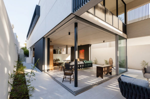
Retractable glass panels retreat into pockets within the wall cavities, allowing the living and dining spaces to be completely opened up to the site’s perimeter. “The concept is that of the site as a room with a lower level glass box, which opens to allow the boundary walls to act as the walls of the living room,” Mark says. “This doesn’t place an emphasis on internal or external living, but rather blurs the distinction and treats them as one and the same.”
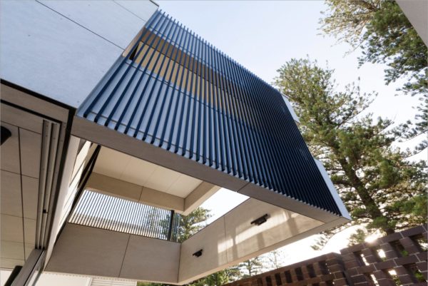
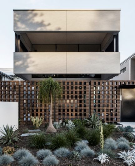
A simplified and solid cantilevered box form seemingly hovers above the glass construction of the lower floor, housing a private suite of bedrooms and living spaces. “The box has a low clearance above the ground floor to encourage the living spaces to spill out horizontally, thereby creating the perception of much wider spaces,” Mark says.
It is supported by a series of slender columns, extending over the lower alfresco entertaining court at the front of the home to create a double volume space. On either side of the box form, a series of vertical aluminium battens filter and direct the view and allow natural light to permeate the forecourt. “The structure has been deliberately designed to frame the view horizontally out towards the sky and Norfolk pines – an icon of the locality – while filtering out the views of pedestrian and vehicle traffic,” Mark says.
The outdoor kitchen in the forecourt can be united with the indoor kitchen by sliding the glass doors away. A Tribú Tosca outdoor setting from Cosh Living features in the forecourt, chosen for its softer form and ambiguous indoor/ outdoor style.
Rather than working to the minimum setbacks and contributing to an already solid streetscape, the house enjoys a generous two metres to either side to define it from the adjacent residences. And, while glass lacks the ability to bestow the privacy the owners briefed for, clever design at the front boundary allows life to go on within the abode in comfortable seclusion. “Privacy from the street is maintained by a screen brick wall featuring perforations, which provides the ability to look out while at the same time obscuring the view,” Mark says.
A simple material palette for the interiors includes ceilings of Equitone cladding, continued from the exterior, while cabinets and built-in items – such as the bookshelf and screen divider in the living zone – comprise Navurban engineered veneer, installed by Euro Trend. Sand-blasted stone flooring from Milano Stone flows from the indoors out downstairs, while upstairs the American White Oak timber floors are from Austim.

Craig Steere Architects worked collaboratively with the client to source and select furnishings. “The client had quite an extensive collection of antiques and was keen to incorporate a number of pieces,” Mark says. “They had a grandfather clock that they didn’t believe would be suitable, but we instantly saw it taking pride of place in the study area and it now forms the rear focal point for the lower floor.” The lower level walls are spacious and positioned to maximise the impact of the owner’s impressive art collection, while a high end furniture selection was carefully curated to harmonise with the existing art and antiques. A Moroso Gentry Lounge and Fritz Hansen Fri Chair, both from Mobilia, were chosen for their soft, organic qualities. “These pieces offer a counterpoint to the more ordered, rectilinear form of the space, allowing both the architecture and the furniture to shine,” Mark says.
A Walter Knoll dining setting with Tadeo table and Cuoio chairs pair with Gubi bar stools, sourced from designFARM. “The dining table is extendable so that it isn’t too big and empty when the owners are home alone, but can accommodate larger groups when entertaining,” Mark says.

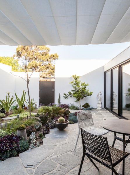
Service and circulation spaces are tucked neatly away, and a number of spaces pull “double duty” functions. A laundry has been merged with concealed cabinetry in a glass passage leading to the rear garage, which can be opened to the courtyard. Storage is incorporated on and under the stair and the study is assimilated into what would have been a passage space, while the upstairs sitting room can be configured as one large space or divided into a smaller sitting room and gym/activity room via bifold doors.
Craig Steere Architects’ innovative design response delivered an ingenious use of space, light and layout that strives beyond the limitations of the traditional four walls. The clients are thrilled with the distinctive concept achieved. “We were invited to have dinner with the owners and, in a jovial moment, we joked that we would be very happy to design another home for them,” Mark says. “They said they couldn’t do it again, because if they tried they could not improve on what has been achieved – which was truly the best praise we could hope for.”


